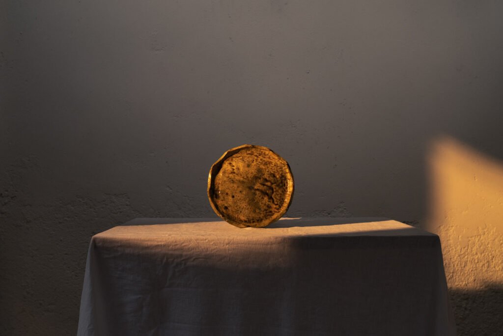
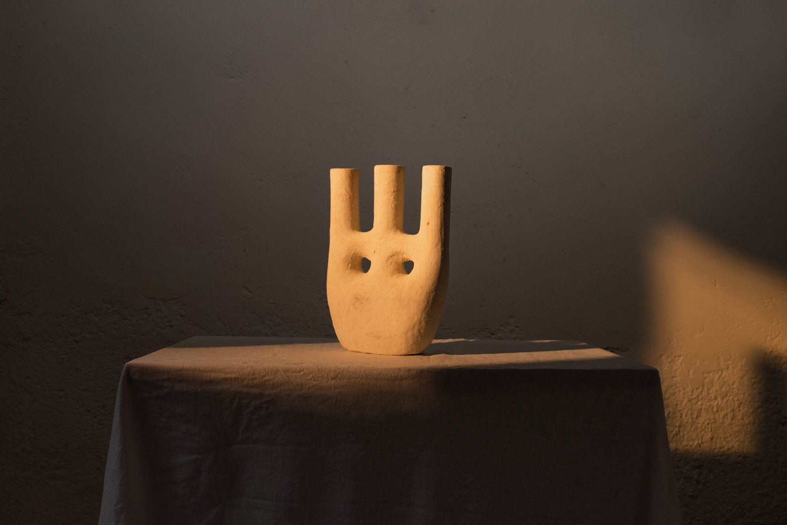
Moroccan clay pieces that show the lesser-known side of the North African country, characterized by its elegant simplicity and refreshing inventiveness.
BRIEF:
The founders of Varro needed a comprehensive rebranding strategy so that their brand identity could match the quality and creativity of their products. We were asked to change all the visual elements, from the logo to the collaterals design, so we led the entire design project, including a beautiful art direction together with IETU films.
SERVICES:
Express Brand Strategy · Competitor analysis · Reference analysis · Visual identity design · Collateral design · Redesign of social media content · Art direction · Brand guardianship
COLORS:
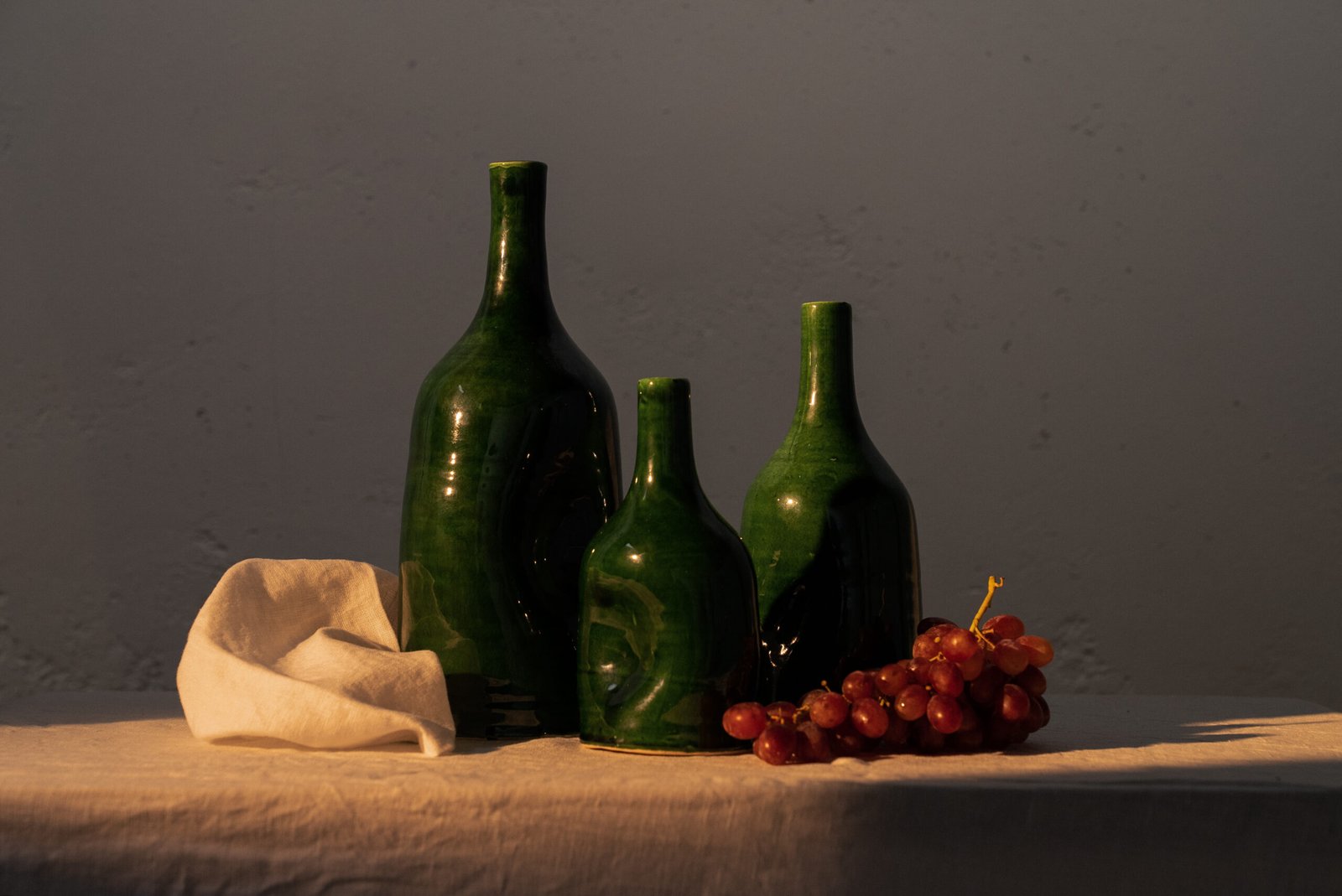
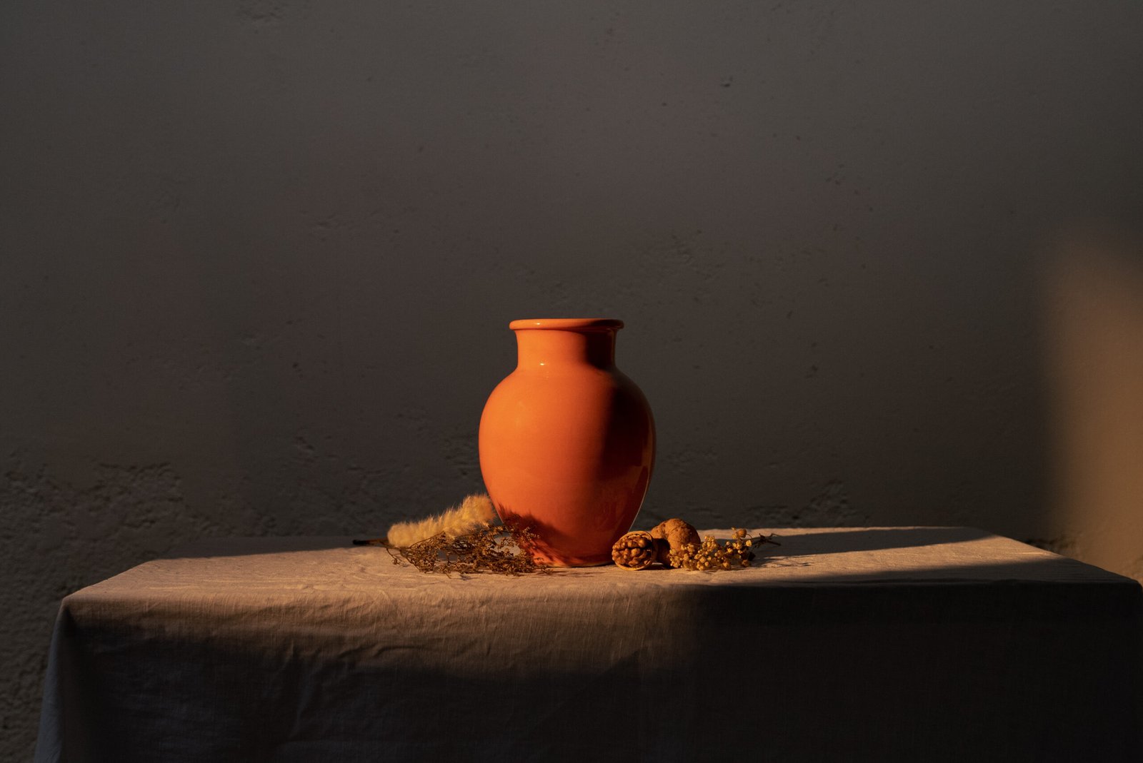
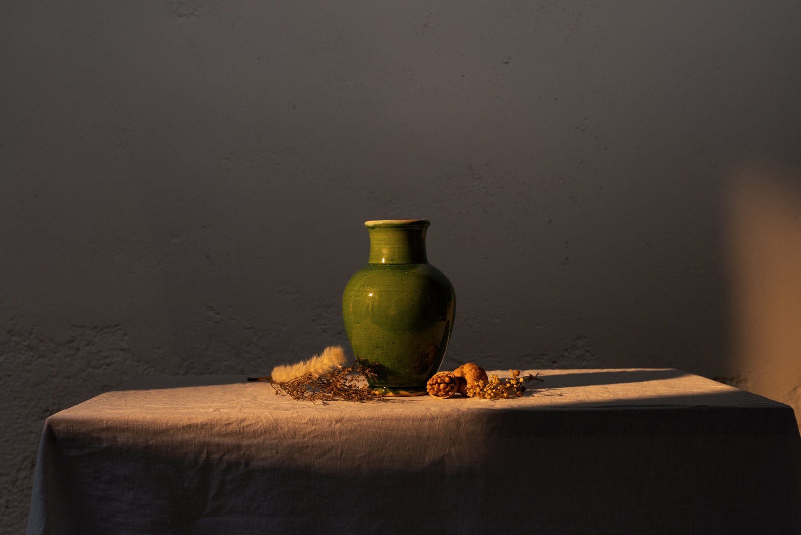
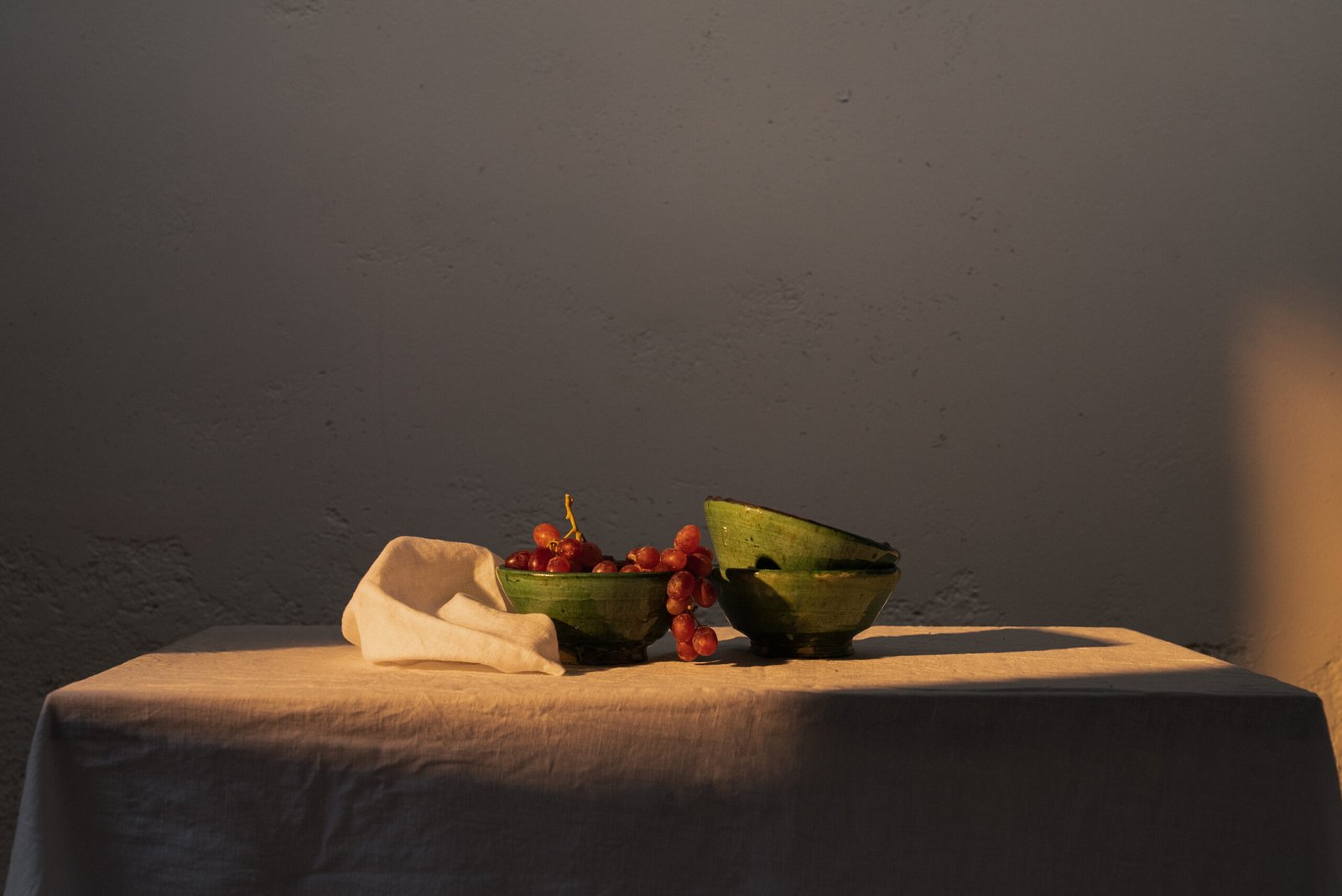
Each Varro vase, tagine and plate tells the story of the hands that shaped them and the landscapes that inspired the colors and patterns on their surface. We use the tiles of the main pottery towns (Fes, Tamegroute, Safi) and the tones of the desert as a reference to curate the color palette. We divide the palette between the two current collections: Noor and Maktub.
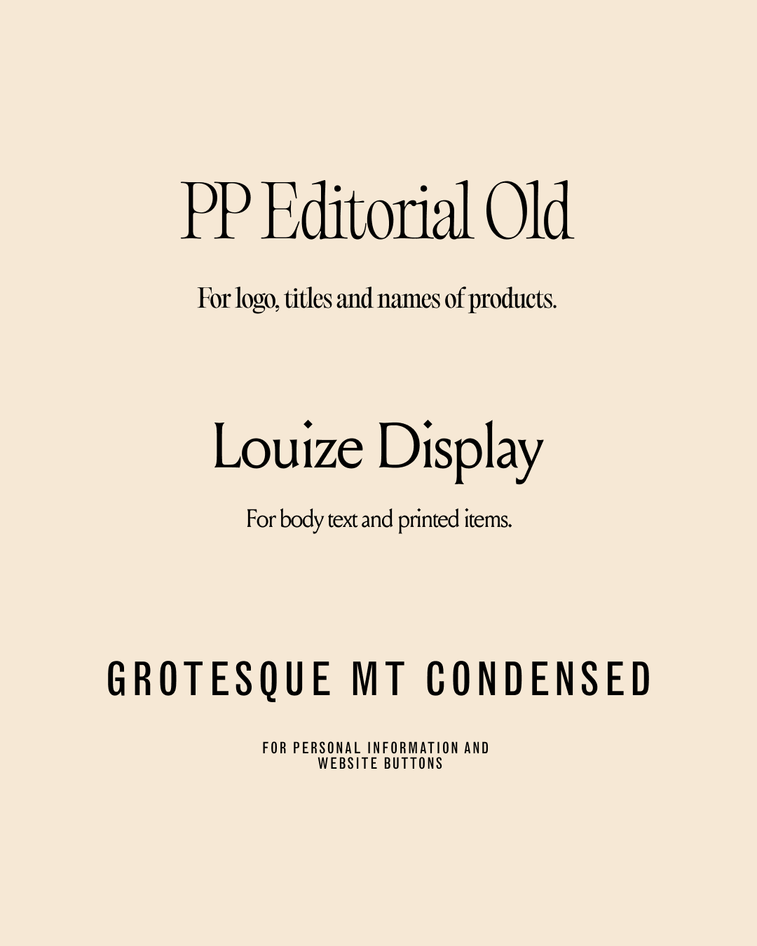
TYPOGRAPHY:
We chose a combination of two serif fonts - inspired by the curves and ornaments of Arabic calligraphy - and a narrow Helvetica, typical of 20th century posters, newspapers and traffic signs in the region.
CREATIVE VALUE:
Each piece of Varro is a "window to the soul of Morocco." We further developed this point and used the silhouettes of the products to illustrate the metaphor. The designs were applied on social media and collaterals.
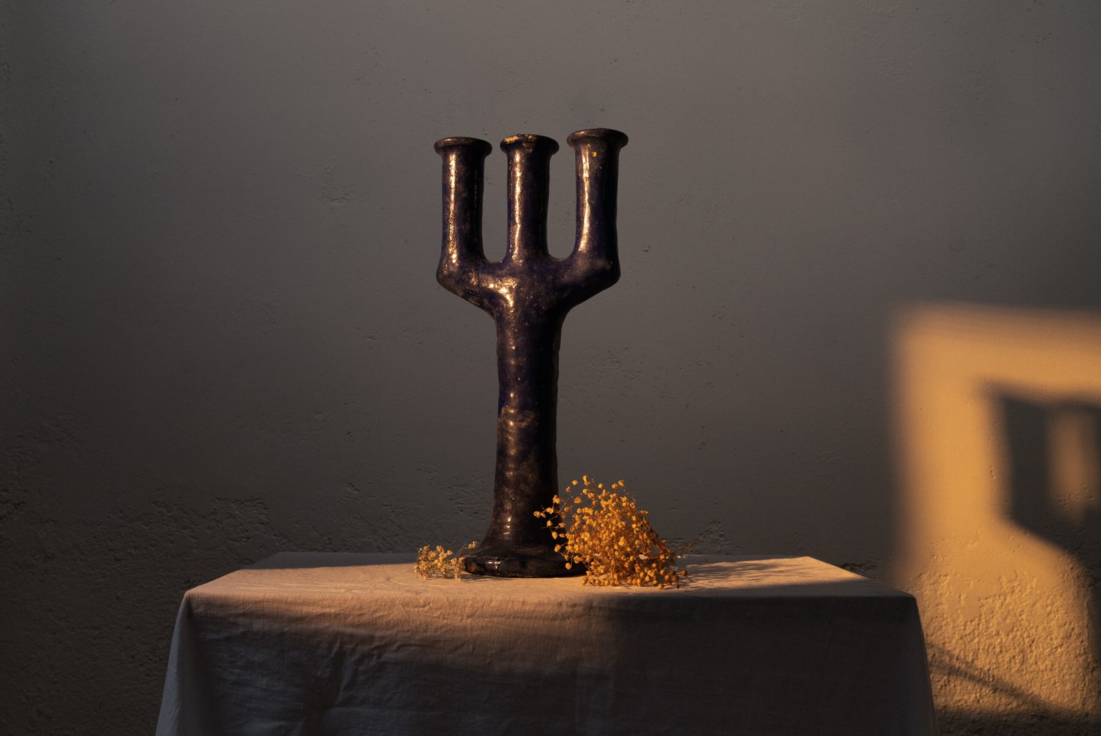
ACTIVATION:
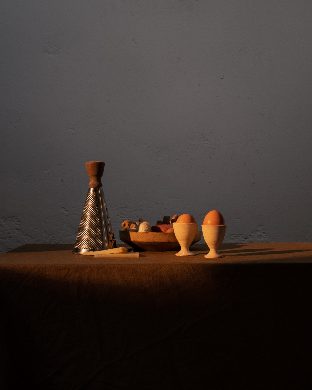
Lastly, we led the Art Direction, by differenciating the two collections through attrezzo elements and colours. Photographed by IETU films.
