A bi-annual publication exploring the relationship between design, culture and the environment in selected destinations.
BRIEF:
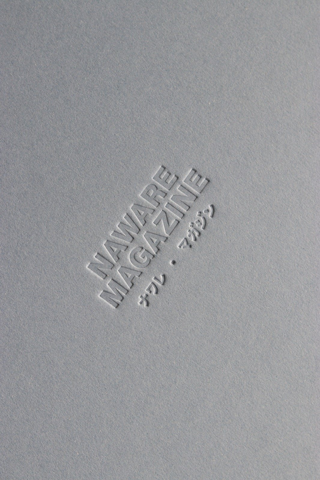
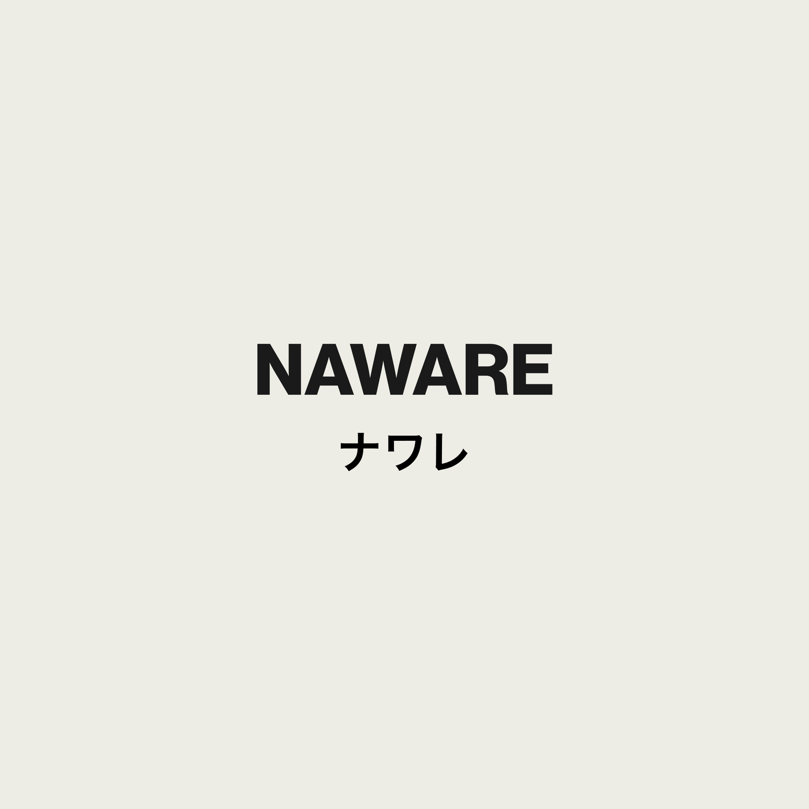
Naware Magazine takes its name from the Japanese expression "Mono no Aware", the beauty of impermanence, since it understands nature from the Asian perspective, one of harmony with human life, as opposed to the attitude of domination typical of the West. With this in mind, we designed the cover and interior of the magazine around Asian aesthetic concepts such as Kuwashi (the beauty of everyday things), Hakanasa (the acceptance of change) or Kiyoshi (aesthetic simplicity). We opted for the "Branding beyond branding" strategy, with small brand variations in each product series. The landscape format of the magazine is a nod to the scrolls used to write on in Asia before the arrival of the Western book.
SERVICES:
Brand Strategy · Content Curation · Market Analysis · Secondary Analysis · Visual Identity Design · Social Media Design · Art Direction · Launch Event Planning and Management
Head designer: Lucía Peralta
PALETTE & PAPER:
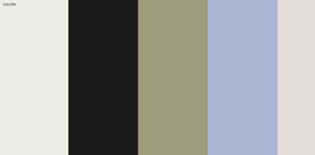
The colour palette is divided accorting to the magazine's section themes. The design sections are colored white, gray and black; the nature sections in light olive green and the culture sections in different tones depending on the destination the issue focuses on.
To give it a luxurious look, we chose Fredigoni's Materica blue textured paper for the cover and BioTop 120g recyclable paper for the inside pages, in line with the magazine's commitment to environmental protection.
TYPOGRAPHY:
Inspired by the fonts of big brands, publications and Asian comics, we chose Neue Haas Grotesk in different weights. We used Hiragino Kaku Gothic ProN for Japanese words. Finally, for the section of the magazine focused on climate activism, we chose WT Kormelink, a common font for magazines about sustainability and the environment.
ACTIVATION:
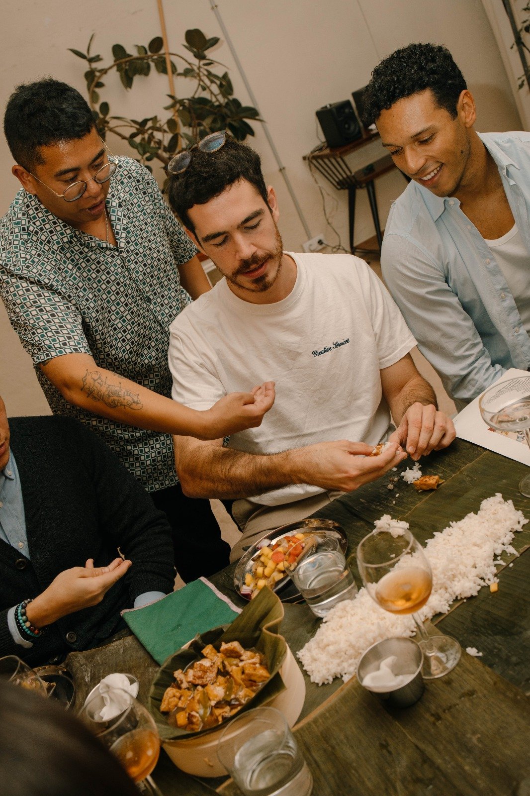
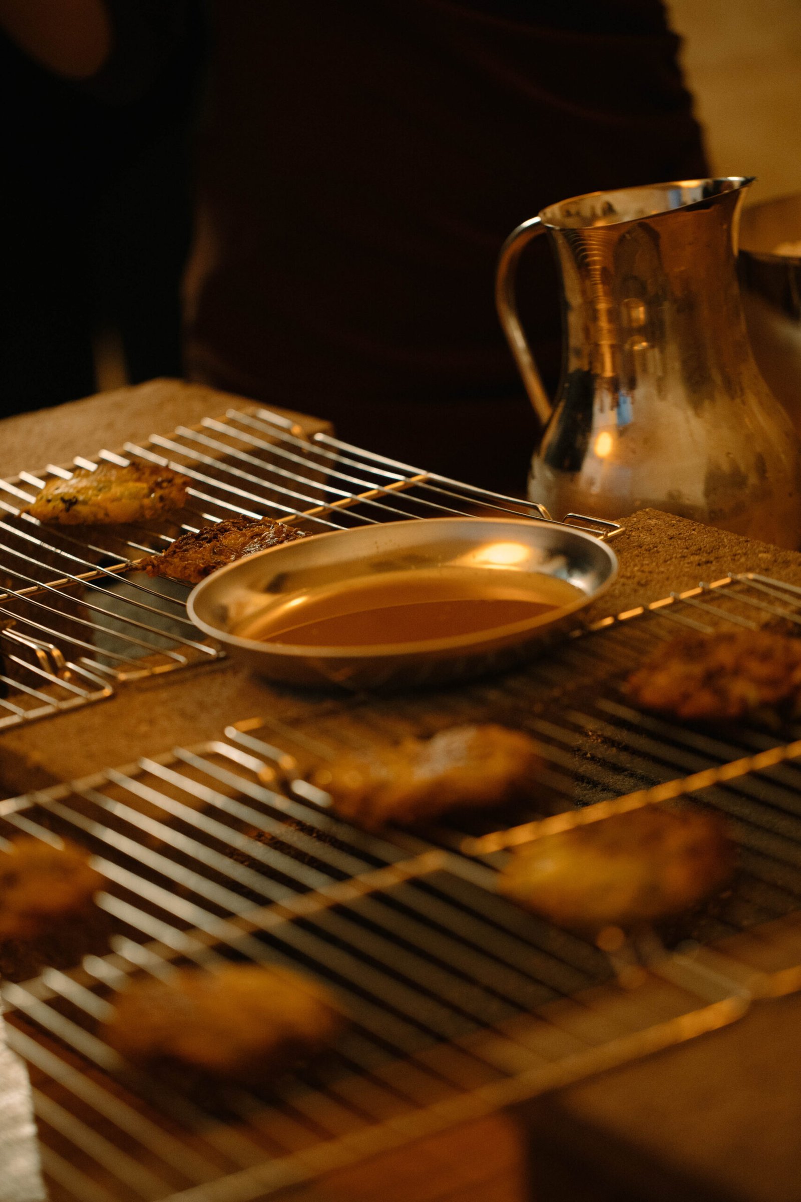
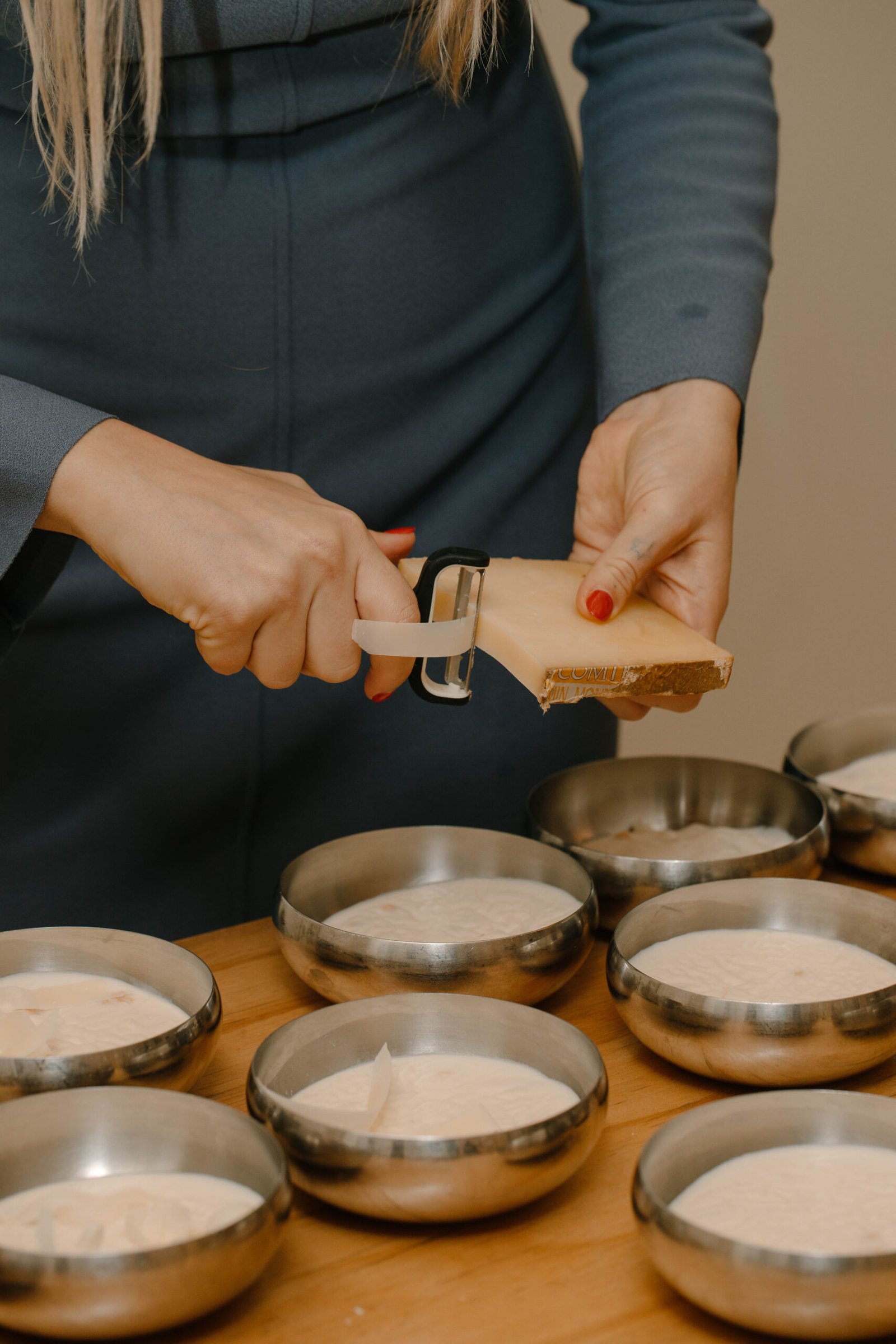
Finally, we led the brand activation process through, on the one hand, web design and development and, on the other hand, the planning of the launch event, which revolved around the target destination of the first issue: the Philippines.

